Harper College is closed Friday, July 3, for Independence Day (Observed).
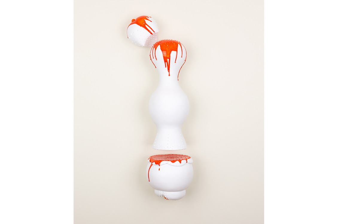
Nikki Renee Anderson
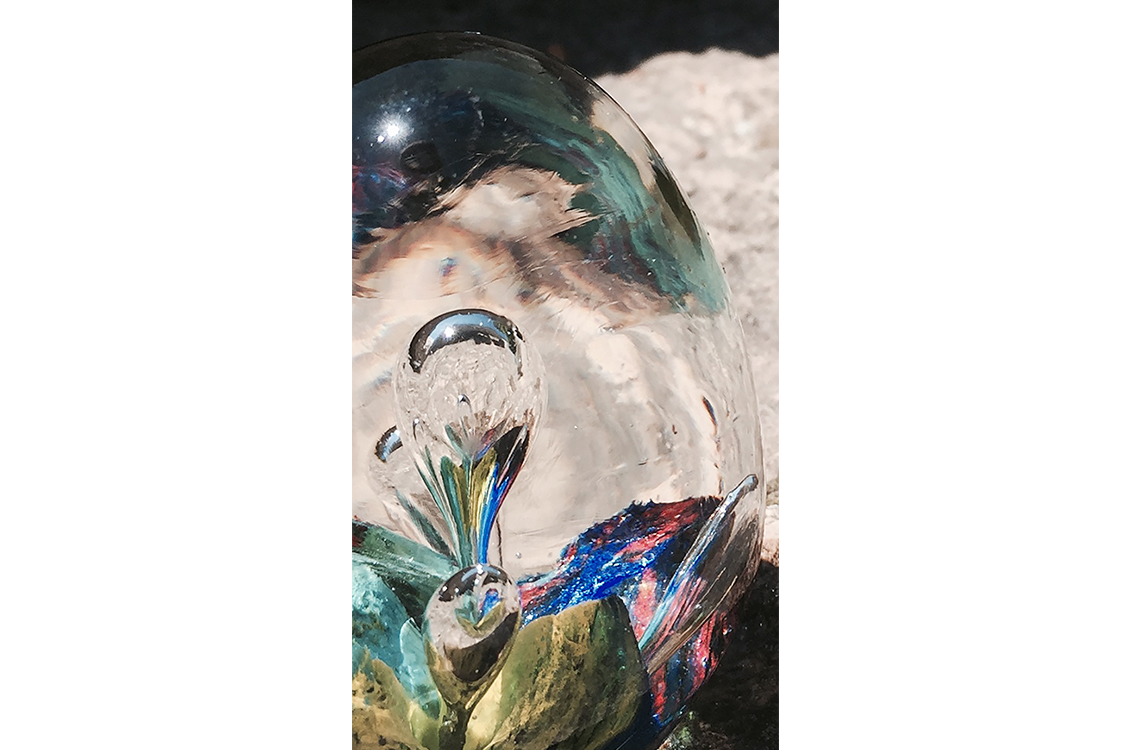
Dreamy Pop, 2019, ceramic and acrylic, 31 x 10 x 7.5"
My sculptures are fantasy objects that explore cultural stereotypes about beauty,
desire and femininity. The forms have reference to the female body and also other
associations to sweets, fruit and flowers. I both participate in traditional roles
and re-imagine them to create new roles. The forms present ideas of temptation and
beauty. Many of my sculptures incorporate the shape of a breast or a nipple, which
doubles as ice cream or candy and can be equated to the bud. The shape functions to
be beautiful, desirable and immediately recognizable as feminine. They are intended
to draw a viewer to get closer to the forms and look as though they could be squeezed
or licked.
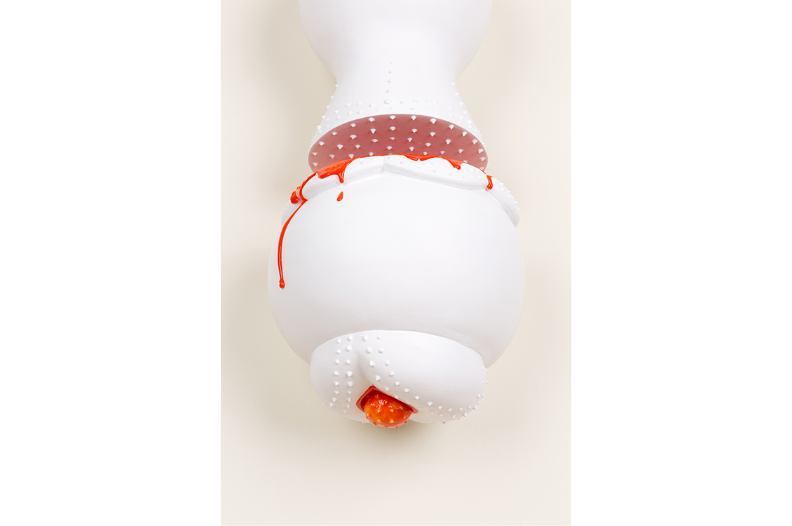
Nikki Renee Anderson
Dreamy Pop, detail
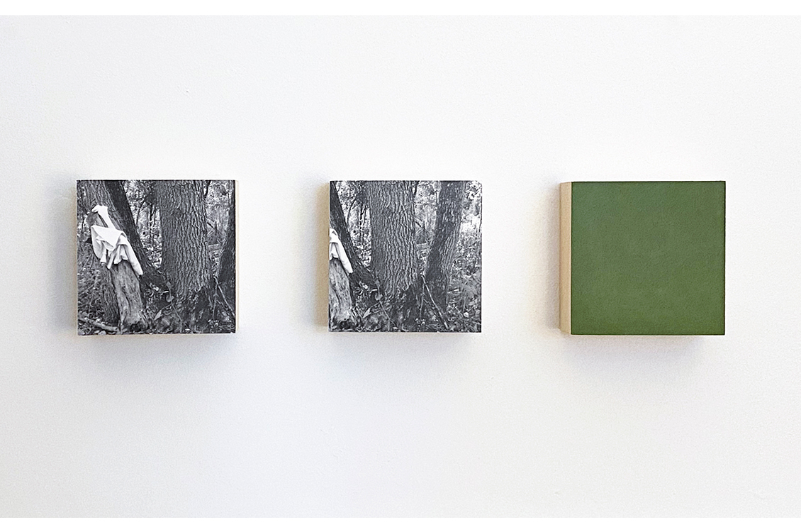
Sandy Barney
Bird, 2020, photographs and oil on panel, 5 x 21 x 2"
Sometimes when viewing a scene, I'm amused by what I initially think I see. And even
when I've identified an object it doesn't always belong. I'm left to wonder why is
it here? These images reference an encounter on a forested bike trail. The overwhelming
green of the forest. Attempting to discern an initially complicated scene until an
object becomes clear. Forming a narrative from bits and pieces.
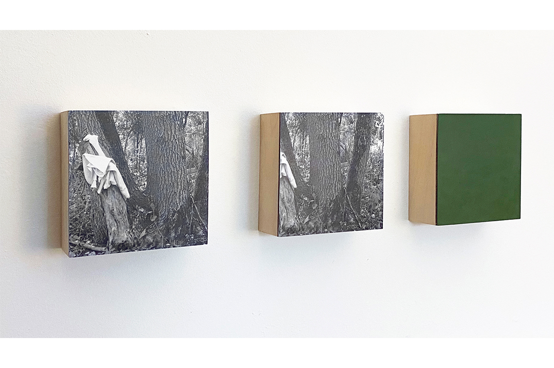
Sandy Barney
Bird, detail
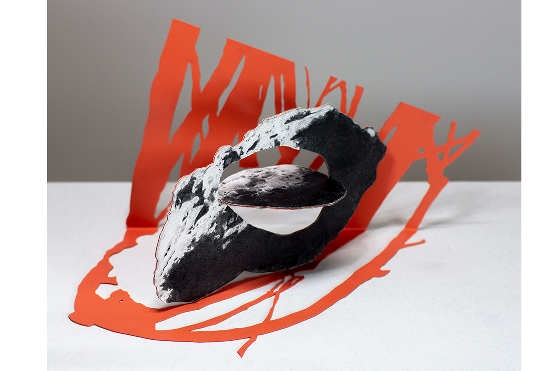
Ann Blaas
Weirdly Comical and all swimming in same Pond, 2020, mixed media on mylar, 14 x 17”
I like to play with space, enmeshed in a mixed language of painting and drawing, language
that for the most part is abstract but contains elements of calligraphy, landscapes,
building references and animal like indications. I am concerned with creating a sense
of motion never quite obtaining equilibrium. I like to push the illogical through
interesting spatial relationships, using biomorphic form that embraces intuition.
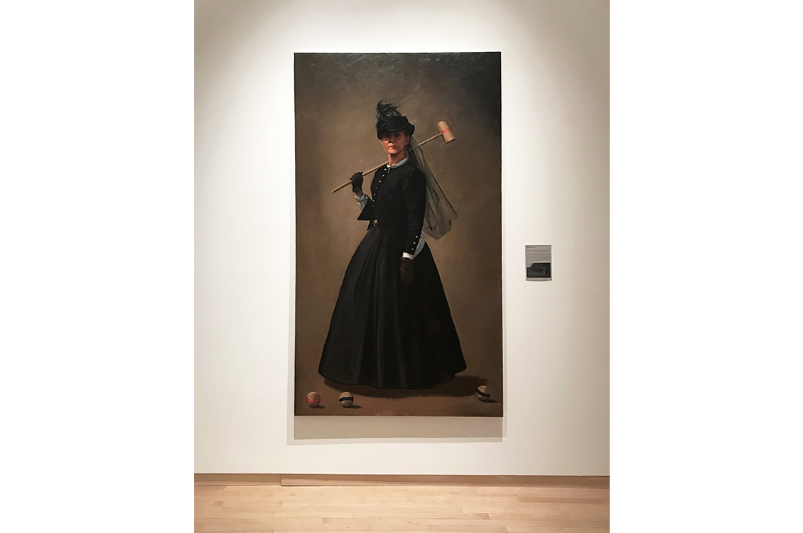
William Blake
Portrait of Aurora, 2018, oil on linen, 2018, 4 x 7'
Inspired by Winslow Homer’s croquet paintings, created during and soon after the Civil
War, I began been hosting croquet matches during Civil War battle reenactments. This
painting acts as a document of my interactions inside a performance of the past. For
me, Homer’s croquet paintings show a relationship between play and tragedy that expresses
the War’s lack of closure. To echo this relationship, the painting depicts an individual
who plays through that War, via war reenactment. We gesture with respect and the desire
to educate, to humble, and to play.
Margaret Buchen
Sightlines, 2020, screen print, 8.5 x 15"
My current work takes inspiration from classic American movies and elements of popular
culture. The works are representational; they are drawn from composites of film stills.
Some works address the themes of identity and introspection within our media-saturated
culture.
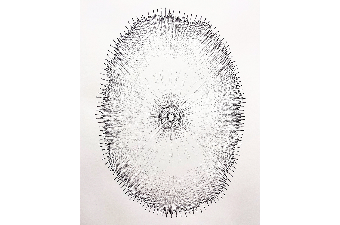
Linda Emmerman
Omphalos, 2020, ink on paper, 44 x 30"
I enjoy experimenting with non-traditional drawing tools and the gestures and marks
they make when I dip them in ink. In this way I am able turn myself over to the tool
and explore what is unique to each of them. The resulting image is a balance of the
unpredictable nature of this process and my ability to exert some control. Because
ink is an indelible medium, it’s a welcome challenge to respond in dialogue
with the piece as it progresses. In building through an accretion of marks, layering,
varied repetition and concentric designs the resulting image pays homage to natural
forms without representing any item specifically.
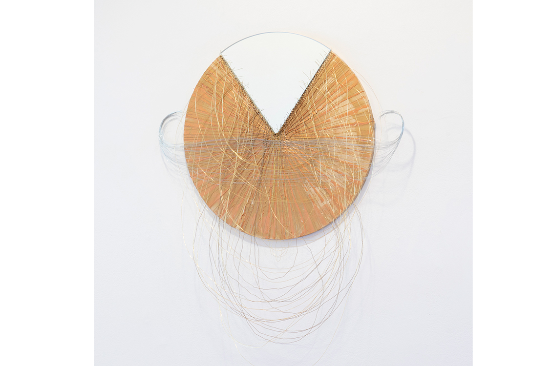
Diana Gabriel
Pectoral Gold, 2020, mirror, wood, wire, acrylic on board, 48 x 24 x 4"
"Tumbaga" is the name of the gold, copper, and silver alloy often used to create ceremonial
adornments by the Pre-Columbian indigenous people of Colombia and other countries
in the lower Americas. Once the Spanish arrived, a large portion of these cultural
artifacts were melted for gold and shipped back to Spain. By using tumbaga colors
in my work, I not only reference the awe and loss I felt while visiting the remaining
cultural relics at the Museo del Oro in Bogota, but also the awe and loss inherent
in my relationship to my own Colombian heritage. Using line and geometry, I forge
a connection with the kind of Colombian handicrafts I deeply revere but never learned,
“restitching” the rift created by my migration.
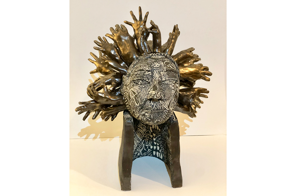
Eloise Heinrich
oh little love; what a fool you are, 2020, underglaze and glaze, 14 x 8 x 18"
I consider touch the focal point of my practice. I use it to understand my surroundings
and connect with others. Through these forms I continue my study of physical and emotional
connections. These sculptures are imitations of people I can no longer touch or ones
I can’t escape. Through this monotonous and labor intensive mark making process
I insert my energy into something else. I believe physical contact is a passage, but
these imitation passages offer no closure, only a ghost of sensation. In this work
I explore the elusive, sensual, and heartbreaking aspects of connection to self and
others.
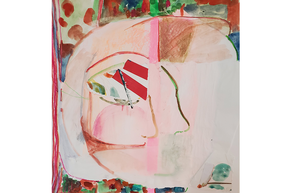
Katherine Jost
Russian Doll, 2020, Mixed Media on Paper, 18 x 18"
This work favors feeling over intellect and humbly explores the relationships between
how instinct, intuition and emotional landscape play a central role in navigating
everyday life. Although I often look to memory, and the nature of memory itself, as
points of departure, this specific work functions to explore repressed feminine empowerment
and aggression. In my process, I welcome chaos, ugliness, absurdity, play, and spontaneity.
Because my process is not premeditated, there is a perpetual balance composed of the
tension between sense of failure and gestures of hope. It is in this place of homoeostasis
that the work seems the closest to mimicking real life. This piece is about breaking
out of a shell that was formerly necessary for survival.
Doug Manley
Flats series #14, 2020, pigment print, 15 x 9"
This image is #14 from the Flats series in which I challenged myself to do no post-camera
manipulation.
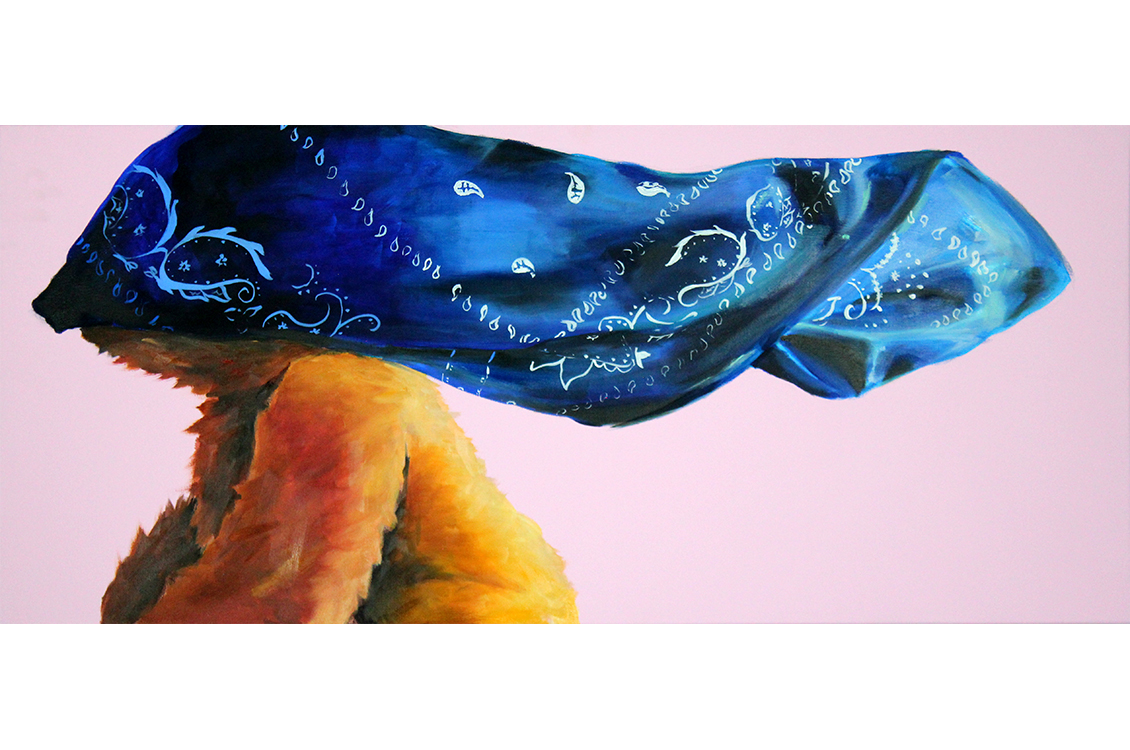
Martinez E-B
Bears and Bandannas: Somerset (series 105), 2018, oil, acrylic, Acryla gouache on
canvas, 16 x 36"
Intrigued by the way particular behaviors, beliefs, and values are absorbed by people
without question, my work seeks to force an examination of those unquestioned things.
In this case, I intentionally complicate and re-contextualize the imagery of the bears
and bandannas which lay as vigil pieces where someone has lost their life. I attempt
to interrogate the complex relationship between the softness and beauty of these objects,
with the uneasy reality, sadness, and horror that causes this reaction of grief.
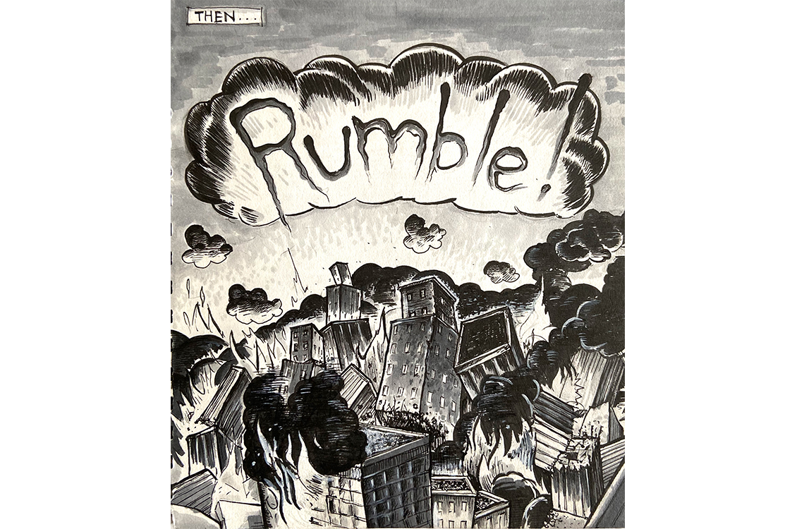
Duffy O'Connor
Rumble 2012-2019, pencil, ink, marker, and gouache, 8 x 9"
Combining my practice in fine arts with my early love for comic book illustration,
"Rumble" is presented as a single frame from a larger narrative. What happens before
and after this image is for the viewer to decide. The exaggeration of the broken and
tumbling buildings channels the hyperbole of superhero comics. The sound, communicated
by the dramatically drawn word and cloud, intensifies the action and disaster that
is occurring.
Jason Peot
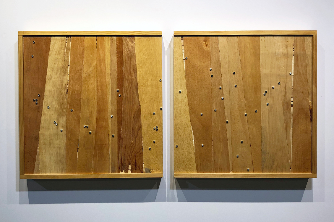
DIVIDED, 2020, wood, steel, 52 x 25 x 3"
I have never made work with any sort of political message but things seem different
now. Back in the beginning of COVID time I pulled out these pieces of "plywood" that
I've saved for years. They were from a Chinese shipping crate. I think they're beautifully
crude. Over the past months, as we've debated our response to the pandemic and China's
role in it, this material has started to mean something different than it had before.
As the quarantine continued it became increasingly apparent just how DIVIDED we are
as a nation. Now, as we grapple with the epidemics of systemic racism, economic inequality
and climate change, the divisions in our country continue to widen.
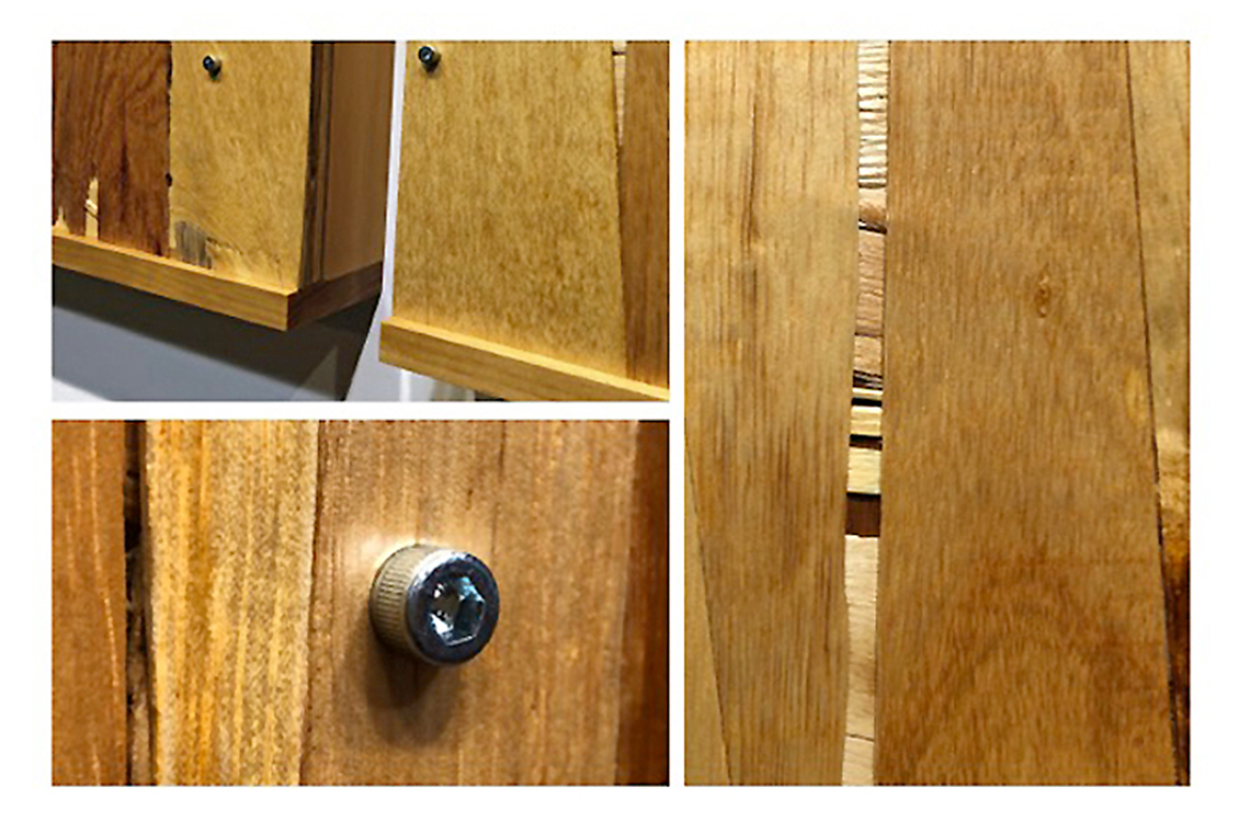
Jason Peot
DIVIDED, detail
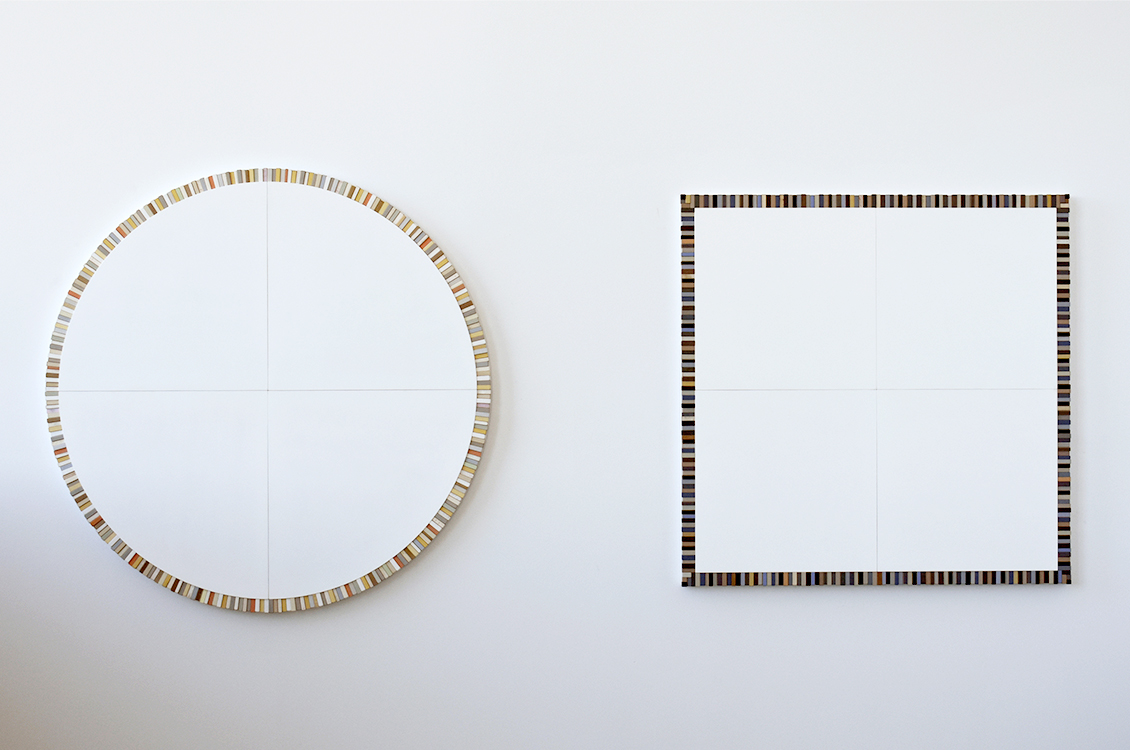
Perry Pollock
Circle and Square, 2019, paint and collage on constructed forms Circle: 48.5 dia.
x 1.75", Square: 42.75 x 42.75 x 1.75"
I've worked with basic geometric forms since the mid-1980s, and have often revisited
the theme of circles and squares in combination as a play of opposites within the
larger context of a geometric unity. Take a moment to contemplate these two shapes.
What meanings do we attach to them? When and how did they originate? What do they
suggest about the relationship between the natural environment, mathematics, and the
things we construct? Both forms in this diptych contain exactly the same amount of
surface area, indicating their different but equal stature. I incorporated the colored
blocks on each to impart a celebratory aura.
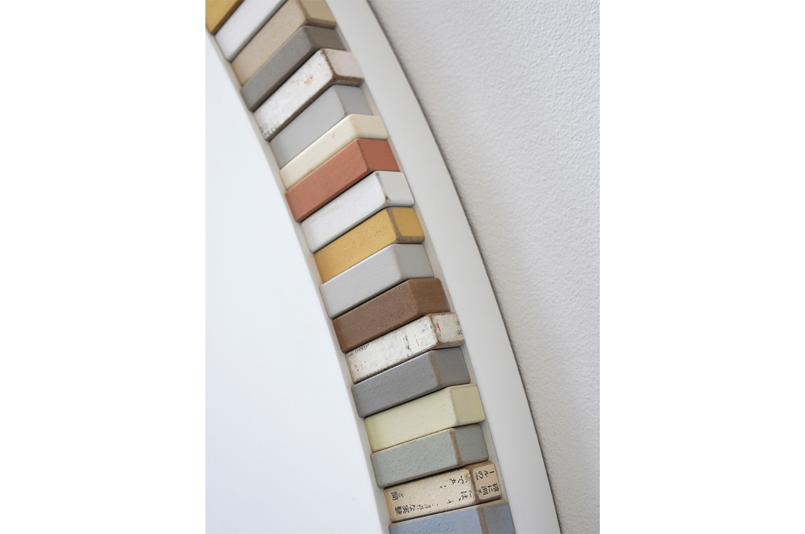
Perry Pollock
Circle and Square, detail
Charles Roderick
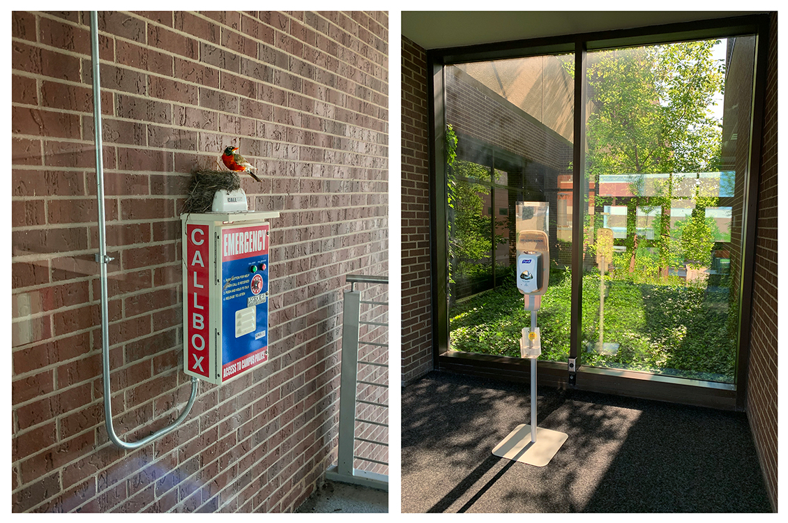
Space in the absence of humans, 2020, digital photograph, 11 x 16"
Outside - EMERGENCY CALLBOX – Bird – Bird nest Inside – HEALTHY HANDS – Window – Vines - Trees
Philip Spangler
Garden Maquette 1, 2020, aluminum, paper, graphite, paint, 7.75 x 11.5 x 12.5"
My work is of and about Lake Michigan rocks, Ohio valley mud, and of the psycho-geography
of places that I call home: Chicago and Southeast Ohio. It is through investigations
of geography and architecture, that I create landscapes blended with objects, and
objects blended with time. These blended forms emerge from a knowing—or unknowing—of space, of time, and of being.
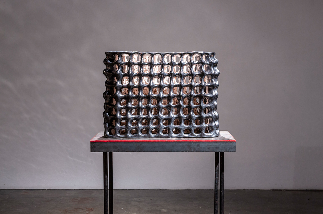
Kristen Walk
Memories Forged, 2019, ceramic, 26 x 13 x 38"
The content of this piece revolves around the use of a single miniature cinder block
to represent a fragment of memory. The finished form references the aesthetic qualities
of ruins and the reparative action of re-building and reinforcing. The enclosed but
apparent interior spaces show the contrast between public and private, hard and soft,
and fragility and strength. Using the small cinder block's repetitive motif, the components
travel through time to evoke feelings of abandoned architecture and lost memory.
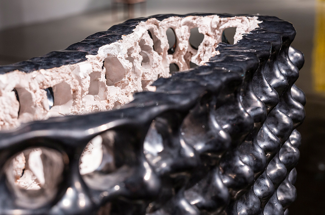
Kristen Walk
Memories Forged, detail
Harper College has an active studio art faculty. In addition to teaching, they are dedicated to making and exhibiting their own work. Collectively, they represent a wide range of concept and material approaches. This biennial exhibition provides an important opportunity for art faculty members to share their work with students, colleagues, and the community.
Nikki Renee Anderson, Dreamy Pop, 2019, ceramic and acrylic, 31 x 10 x 7.5”
My sculptures are fantasy objects that explore cultural stereotypes about beauty, desire and femininity. The forms have reference to the female body and also other associations to sweets, fruit and flowers. I both participate in traditional roles and re-imagine them to create new roles. The forms present ideas of temptation and beauty. Many of my sculptures incorporate the shape of a breast or a nipple, which doubles as ice cream or candy and can be equated to the bud. The shape functions to be beautiful, desirable and immediately recognizable as feminine. They are intended to draw a viewer to get closer to the forms and look as though they could be squeezed or licked.
Sandy Barney, Bird, 2020, photographs and oil on panel, 5 x 21 x 2”
Sometimes when viewing a scene, I’m amused by what I initially think I see. And even when I’ve identified an object it doesn’t always belong. I’m left to wonder why is it here? These images reference an encounter on a forested bike trail. The overwhelming green of the forest. Attempting to discern an initially complicated scene until an object becomes clear. Forming a narrative from bits and pieces.
Ann Blaas, Weirdly Comical and all swimming in same Pond, 2020, mixed media on mylar, 14 x 17”
I like to play with space, enmeshed in a mixed language of painting and drawing, language that for the most part is abstract but contains elements of calligraphy, landscapes, building references and animal like indications. I am concerned with creating a sense of motion never quite obtaining equilibrium. I like to push the illogical through interesting spatial relationships, using biomorphic form that embraces intuition.
William Blake, Portrait of Aurora, 2018, oil on linen, 2018, 4 x 7’
Inspired by Winslow Homer’s croquet paintings, created during and soon after the Civil War, I began been hosting croquet matches during Civil War battle reenactments. This painting acts as a document of my interactions inside a performance of the past. For me, Homer’s croquet paintings show a relationship between play and tragedy that expresses the War’s lack of closure. To echo this relationship, the painting depicts an individual who plays through that War, via war reenactment. We gesture with respect and the desire to educate, to humble, and to play.
Margaret Buchen, Sightlines, 2020, screen print, 8.5 x 15”
My current work takes inspiration from classic American movies and elements of popular culture. The works are representational; they are drawn from composites of film stills. Some works address the themes of identity and introspection within our media-saturated culture.
Linda Emmerman, Omphalos, 2020, ink on paper, 44 x 30”
I enjoy experimenting with non-traditional drawing tools and the gestures and marks they make when I dip them in ink. In this way I am able turn myself over to the tool and explore what is unique to each of them. The resulting image is a balance of the unpredictable nature of this process and my ability to exert some control. Because ink is an indelible medium, it’s a welcome challenge to respond in dialogue with the piece as it progresses. In building through an accretion of marks, layering, varied repetition and concentric designs the resulting image pays homage to natural forms without representing any item specifically.
Diana Gabriel, Pectoral Gold, 2020, mirror, wood, wire, acrylic on board, 48 x 24 x 4"
“Tumbaga” is the name of the gold, copper, and silver alloy often used to create ceremonial adornments by the Pre-Columbian indigenous people of Colombia and other countries in the lower Americas. Once the Spanish arrived, a large portion of these cultural artifacts were melted for gold and shipped back to Spain. By using tumbaga colors in my work, I not only reference the awe and loss I felt while visiting the remaining cultural relics at the Museo del Oro in Bogota, but also the awe and loss inherent in my relationship to my own Colombian heritage. Using line and geometry, I forge a connection with the kind of Colombian handicrafts I deeply revere but never learned, “restitching” the rift created by my migration.
Eloise Heinrich, oh little love; what a fool you are, 2020, underglaze, and glaze, 14 x 8 x 18”
I consider touch the focal point of my practice. I use it to understand my surroundings and connect with others. Through these forms I continue my study of physical and emotional connections. These sculptures are imitations of people I can no longer touch or ones I can’t escape. Through this monotonous and labor intensive mark making process I insert my energy into something else. I believe physical contact is a passage, but these imitation passages offer no closure, only a ghost of sensation. In this work I explore the elusive, sensual, and heartbreaking aspects of connection to self and others.
Katherine Jost, Russian Doll, 2020, Mixed Media on Paper, 18 x 18”>
This work favors feeling over intellect and humbly explores the relationships between how instinct, intuition and emotional landscape play a central role in navigating everyday life. Although I often look to memory, and the nature of memory itself, as points of departure, this specific work functions to explore repressed feminine empowerment and aggression. In my process, I welcome chaos, ugliness, absurdity, play, and spontaneity. Because my process is not premeditated, there is a perpetual balance composed of the tension between sense of failure and gestures of hope. It is in this place of homoeostasis that the work seems the closest to mimicking real life. This piece is about breaking out of a shell that was formerly necessary for survival.
Doug Manley, Flats series #14, 2020, pigment print, 15 x 9”
This image is #14 from the Flats series in which I challenged myself to do no post-camera manipulation. View the Flats series on Youtube.
Martinez E-B, Bears and Bandannas: Somerset (series 105), 2018, oil, acrylic, Acryla Gouache on canvas, 16 x 36”
Intrigued by the way particular behaviors, beliefs, and values are absorbed by people without question, my work seeks to force an examination of those unquestioned things. In this case, I intentionally complicate and re-contextualize the imagery of the bears and bandannas which lay as vigil pieces where someone has lost their life. I attempt to interrogate the complex relationship between the softness and beauty of these objects, with the uneasy reality, sadness, and horror that causes this reaction of grief.
Duffy O'Connor, Rumble, 2012-2019, pencil, ink, marker, and gouache, 8 x 9"
Combining my practice in fine arts with my early love for comic book illustration, Rumble is presented as a single frame from a larger narrative. What happens before and after this image is for the viewer to decide. The exaggeration of the broken and tumbling buildings channels the hyperbole of superhero comics. The sound, communicated by the dramatically drawn word and cloud, intensifies the action and disaster that is occurring.
Jason Peot, DIVIDED, 2020, wood, steel, 52 x 25 x 3”
I have never made work with any sort of political message but things seem different now. Back in the beginning of COVID time I pulled out these pieces of “plywood” that I’ve saved for years. They were from a Chinese shipping crate. I think they’re beautifully crude. Over the past months, as we’ve debated our response to the pandemic and China’s role in it, this material has started to mean something different than it had before. As the quarantine continued it became increasingly apparent just how DIVIDED we are as a nation. Now, as we grapple with the epidemics of systemic racism, economic inequality and climate change, the divisions in our country continue to widen.
Perry Pollock, Circle and Square, 2019, paint and collage on constructed forms Circle: 48.5 di. x 1.75", Square: 42.75 x 42.75 x 1.75"
I've worked with basic geometric forms since the mid-1980s, and have often revisited the theme of circles and squares in combination as a play of opposites within the larger context of a geometric unity. Take a moment to contemplate these two shapes. What meanings do we attach to them? When and how did they originate? What do they suggest about the relationship between the natural environment, mathematics, and the things we construct? Both forms in this diptych contain exactly the same amount of surface area, indicating their different but equal stature. I incorporated the colored blocks on each to impart a celebratory aura.
Charles Roderick, Space in the absence of humans, 2020, digital photograph, 11 x 16”
Outside - EMERGENCY CALLBOX – Bird - Bird nest
Inside - HEALTHY HANDS – Window – Vines – Trees
Philip Spangler, Garden Maquette 1, 2020, aluminum, paper, graphite, paint, 7.75 x 11.5 x 12.5”
My work is of and about Lake Michigan rocks, Ohio valley mud, and of the psycho-geography of places that I call home: Chicago and Southeast Ohio. It is through investigations of geography and architecture, that I create landscapes blended with objects, and objects blended with time. These blended forms emerge from a knowing—or unknowing—of space, of time, and of being.
Kristen Walk, Memories Forged, 2019, ceramic, 26 x 13 x 38”
The content of this piece revolves around the use of a single miniature cinder block to represent a fragment of memory. The finished form references the aesthetic qualities of ruins and the reparative action of re-building and reinforcing. The enclosed but apparent interior spaces show the contrast between public and private, hard and soft, and fragility and strength. Using the small cinder block's repetitive motif, the components travel through time to evoke feelings of abandoned architecture and lost memory.